|
|

|
|
|
|
|||||||
| EuroFordClub.com European Ford Owners Club of Australia forum |
 |
|
|
Thread Tools | Display Modes |
 27-02-2005, 03:03 AM
|
#1 | ||
|
Fairmont Ghia

Join Date: Dec 2004
Location: NSW
Posts: 2,144
|
Ok, fordel and I have worked tirelessly burning the midnight oil to come up with a couple of suggestions for a club sticker logo. If nothing else, it should prompt some more entries!
1) By fordel: -------------------------- 2) By Timmeh (that's me): -------------------------- 3) By fordel: -------------------------- 4) By me again: -------------------------- Here is how said stickers could look like on a car (in this case, Matts! Thanks Matt! I promise I'll put your car back when I am finished with it).  -------------------------- Remember, they have to be easily readable from a long distance (is readable even a real word?), clear, but stylish. Time to step up to the plate and show us what you're made of, so we can laugh at your feeble attempts! coz lets face it, between our second two, you guys got nothin! Tim Last edited by Timmeh; 27-02-2005 at 03:44 AM. |
||

|

|
|
27-02-2005, 03:06 AM
|
#2 | ||
|
Tricolore Tard
 
Join Date: Dec 2004
Location: Brisbane
Posts: 1,954
|
Im thinking my 2nd one is a dead set winner hands down !
And yes lets see what else you lot can do ;) Chris
__________________
|
||
|
|
|
|
27-02-2005, 03:12 AM
|
#3 | ||
|
Fairmont Ghia
Join Date: Dec 2004
Location: NSW
Posts: 2,144
|
All entries must be in before 5am today too...
Tim! |
||
|
|
|
|
27-02-2005, 03:39 AM
|
#4 | ||
|
THCC Motorsport member 1

Join Date: Dec 2004
Location: the ghetto....no im being serious!
Posts: 1,139
|
aight heres a few random ideas although i dunno if i can compete with the last two entries :hihi:
 enjoy...
__________________
Southcyde Designs<------click here  : : Member of the MTAS Founder of TTM (team twink motorsport) Founder of the AFFDDPS (Australian Ford Forums Drink Driving Punishment Squad) |
||
|
|
|
|
27-02-2005, 03:45 AM
|
#5 | ||
|
Tricolore Tard
Join Date: Dec 2004
Location: Brisbane
Posts: 1,954
|
at least you made the 5am deadline
 Chris
__________________
|
||
|
|
|
|
27-02-2005, 03:47 AM
|
#6 | ||
|
THCC Motorsport member 1
Join Date: Dec 2004
Location: the ghetto....no im being serious!
Posts: 1,139
|
oops i forgot my kila entry, i had to put myself in the running cause them last two tim and chris did.....damn man talk about qu-a-la-tee :P
 now whos cool huh???? :hihi:
__________________
Southcyde Designs<------click here : Member of the MTAS Founder of TTM (team twink motorsport) Founder of the AFFDDPS (Australian Ford Forums Drink Driving Punishment Squad) |
||
|
|
|
|
27-02-2005, 03:47 AM
|
#7 | ||
|
Fairmont Ghia
Join Date: Dec 2004
Location: NSW
Posts: 2,144
|
Hey some good (and one interesting
 ) designs there!! ) designs there!!On a side note, did you want your name on eurofordclub.com changed from your old name to your new one? I can do it easily enough. Tim Last edited by Timmeh; 27-02-2005 at 03:49 AM. Reason: Coz its 2.40 ish AM and my brain isnt working properly... my head hurts... |
||
|
|
|
|
27-02-2005, 03:51 AM
|
#8 | |||
|
THCC Motorsport member 1
Join Date: Dec 2004
Location: the ghetto....no im being serious!
Posts: 1,139
|
Quote:
me says go for it :P cheers
__________________
Southcyde Designs<------click here : Member of the MTAS Founder of TTM (team twink motorsport) Founder of the AFFDDPS (Australian Ford Forums Drink Driving Punishment Squad) |
|||
|
|
|
|
27-02-2005, 03:51 AM
|
#9 | ||
|
Tricolore Tard
Join Date: Dec 2004
Location: Brisbane
Posts: 1,954
|
nice work on that 2nd one andy ;)
almost makes it into the same league as Tim and mine ;) Chris
__________________
|
||
|
|
|
|
27-02-2005, 03:52 AM
|
#10 | ||
|
Fairmont Ghia
Join Date: Dec 2004
Location: NSW
Posts: 2,144
|
Gee, thanks for 'letting' me do it!
 : : Consider it done! :nutsycuck Tim |
||
|
|
|
|
27-02-2005, 03:54 AM
|
#11 | ||
|
Tricolore Tard
Join Date: Dec 2004
Location: Brisbane
Posts: 1,954
|
ROFL.....
good work Tim ;) Chris
__________________
|
||
|
|
|
|
27-02-2005, 04:01 AM
|
#12 | ||
|
THCC Motorsport member 1
Join Date: Dec 2004
Location: the ghetto....no im being serious!
Posts: 1,139
|
alrighty then heres another idea of where you could put your sticka!
P.S sticker looks a bit dodge, cause i had to make it fit, would look better in the flesh(so to speak :P) 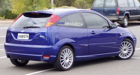 P.S thanks Tim :P
__________________
Southcyde Designs<------click here : Member of the MTAS Founder of TTM (team twink motorsport) Founder of the AFFDDPS (Australian Ford Forums Drink Driving Punishment Squad) Last edited by champsky; 27-02-2005 at 04:02 AM. Reason: same as tims reason hahahaha |
||
|
|
|
|
27-02-2005, 04:05 AM
|
#13 | ||
|
Tricolore Tard
Join Date: Dec 2004
Location: Brisbane
Posts: 1,954
|
damn it now i have to have an edit reason as well, im falling behind here !
heres where you can shove your stika !... lol looks good there tho ! Chris
__________________
Last edited by fordel; 27-02-2005 at 04:06 AM. Reason: ahh here is my edit reason... damn tiredness ! |
||
|
|
|
|
27-02-2005, 04:57 PM
|
#14 | ||
|
FF.Com.Au Hardcore
Join Date: Jan 2005
Posts: 792
|
I like the first one by fordel the most. Champskies ones just don't look nice in my eyes.
The others arn't worth a mention.
__________________
COLORADO RED FIESTA ZETEC MODS - Window Tint, Bmc Panel Filter, Euro Plates, Ghia grill, Momo F16 leather gearknob, Momo Leather gearboot, WQ Zetec Front sway bar, WQ Zetec Sway bar links, WQ Zetec bushes. ICE - Alpine CDA9827, MbQuart Reference 6.5inch splits, MbQuart Reference rears, Rockford Fosgate Punch Stage 3 12inch Sub, Rockford Fosgate P4004 + P3001. |
||
|
|
|
|
27-02-2005, 05:09 PM
|
#15 | ||
|
Clio 182 CUP!

Join Date: Feb 2005
Location: Inner West, Sydney
Posts: 2,590
|
OK, with the given logo choices, i love the first one by Fordel, BUT i think we should use Champsky's idea, and have the 'EURO' written in blue, and 'FORDCLUB' in white, hence for the stand out effect... Dont mind the font of champsky's eurofordclub below the EFC design either.
But from the pic on matt's car, i think i love fordel's logo, with 'euro' in blue... so when can we order?! Tim thinks 2 colours may increase price... if they do, can i get custom so its just like i said above??? 
__________________
------------- Steven 'In fact, so good is the Clio 182 with the Cup chassis set-up that I feel moved to make a bold statement - I think it's the best hot hatch ever built.' (EVO Jan 04) Last edited by Teki04; 27-02-2005 at 05:11 PM. Reason: had 4 hours sleep the day before... just noticed heaps of spelling errors |
||
|
|
|
|
27-02-2005, 05:39 PM
|
#16 | ||
|
Candy White GTI

Join Date: Jan 2005
Posts: 1,516
|
i like the one on the silver focus. back window. looks noice. ill take one
|
||
|
|
|
|
27-02-2005, 06:29 PM
|
#17 | ||
|
Supes

Join Date: Jan 2005
Location: Sydney
Posts: 1,063
|
ok. I will dredge up my designs....but one point I want to make is that the colours you choose have to stand out, you can't use a dark colour as it blends too much, a dark blue or black sticker is pointless on a window.
the blues I was running with were lighter blues (think Tim's focus blue). alternate if you do want a dark colour you would want to consider a white background to it
__________________
Yes I DO drive a Toyota Last edited by whippet_zetec; 28-02-2005 at 09:17 AM. |
||
|
|
|
|
27-02-2005, 06:38 PM
|
#18 | ||
|
Zoom Zoom

Join Date: Jan 2005
Location: Melbourne, VIC
Posts: 4,352
|
DAMN now that's a nice looking car!! Screw the sticker, I'll take one of thos.... hey hang on a minute!!!!
 I really like the sticker design you've whacked on my window there, using the fOCUS font I think it's awesome. Simple and not too over the top, easy to read and not gimmicky. Could look very professional under an official Ford logo on a shirt, without having to design a whacky logo ourselves. Our trademark could indeed be the fact that our logo is a net address, which would also heavily support our entrenchment on the forums here. Sound good? We could then make a smaller logo maybe incorporating the Euro yellow stars surrounding a Ford logo... simple.. Euro Ford. Don't get any simpler or easier to understand than that.  
__________________
2012 Mazda3 MPS
 Last edited by zetec; 27-02-2005 at 07:01 PM. |
||
|
|
|
|
27-02-2005, 06:59 PM
|
#19 | |||
|
Fairmont Ghia
Join Date: Dec 2004
Location: NSW
Posts: 2,144
|
Quote:
Also, these stickers are usually vinyl cut, so multiple colors means two cuts from different sheets of vinyl, could get expensive, but certainly not impossible. Tim |
|||
|
|
|
|
27-02-2005, 07:22 PM
|
#20 | ||
|
Supes
Join Date: Jan 2005
Location: Sydney
Posts: 1,063
|
ok here are a couple of basic ones Ive dredged up......
was thinking of a logo one like the soccer team logos in the UK where the "E" "F" & "C" would be overlapped on each other.....
__________________
Yes I DO drive a Toyota |
||
|
|
|
|
27-02-2005, 07:31 PM
|
#21 | |||
|
Supes
Join Date: Jan 2005
Location: Sydney
Posts: 1,063
|
Quote:
1. While I like the focus font, its a focus thing and we have just decided to include all eurofords, not all eurofords use the focus font for their badges. So I think I would be more inclined to go for a generic font as for one used for a particular model. 2. I would discourage us from our club logo as a net address, this brings us to the point raised earlier in the tread, there is a whole other world out there that isnt online, lets not pigeon hole ourselves into being an online only club.
__________________
Yes I DO drive a Toyota Last edited by whippet_zetec; 27-02-2005 at 07:33 PM. |
|||
|
|
|
|
27-02-2005, 07:36 PM
|
#22 | ||
|
Fairmont Ghia
Join Date: Dec 2004
Location: NSW
Posts: 2,144
|
I agree with Todd, but I do like the font in the sense that it stands out from the crowd of generic fonts, is still easy to read yet instantly recognisable.
A clever design like the soccer clubs has is good when you are fimiliar with it, or have time to look at it, but for an advertising point of view on a car sticker, it would need to be clear and easy to understand, within a few seconds max. As a separate design for say the site or shirts, thats a different matter, where people have more time. Tim |
||
|
|
|
|
27-02-2005, 07:47 PM
|
#23 | ||
|
Supes
Join Date: Jan 2005
Location: Sydney
Posts: 1,063
|
yep, a car sticker needs to be easily read when flying past at 80km/h, no disagreement there.
a logo however should/would appear on the website, shirts, other stickers, banners, pamphlets in conjunction with the website name
__________________
Yes I DO drive a Toyota |
||
|
|
|
|
27-02-2005, 11:20 PM
|
#24 | ||
|
Tricolore Tard
Join Date: Dec 2004
Location: Brisbane
Posts: 1,954
|
Well the font that i used for the first desgin isnt totally the focus font, only the "F" is, the rest of it is actually a totally seperate normal everyday windows font.
Chris
__________________
|
||
|
|
|
|
28-02-2005, 11:49 AM
|
#25 | ||
|
Phat-Euro

Join Date: Jan 2005
Location: Punchbowl BRO!
Posts: 118
|
i like to first one... But as you said it has to be a generic font....and too be hosest i think i like the fiesta font way better.... And too boot i think if memory serves me correctly the new focus font is going to be the same as the fiesta... So wouldnt it make more sense to use that one?
I do know however that it had to be straight and in one line! i dont like the look of have it being 3 words going down one after the other....Just looks crappy! Does anyone have the fiesta font? Russ
__________________
Wake up and smell the FOCUS! |
||
|
|
|
|
28-02-2005, 11:59 AM
|
#26 | ||
|
Phat-Euro
Join Date: Jan 2005
Location: Punchbowl BRO!
Posts: 118
|
And i forgot to say that i like the sticker on Matts car done by tim cause it would work as a logo on our web site. The effect of making the EUROFORDCLUB in a more readable font (Well if readable isnt a work i want to make it one!) followed by the .com in a less easy to read by still readable (Yep my work now!)
This shows that we arnt a web only base club but at the same time give us some good advertisment for the webby! Thoughts? Russ
__________________
Wake up and smell the FOCUS! |
||
|
|
|
|
28-02-2005, 12:56 PM
|
#27 | ||
|
Zoom Zoom
Join Date: Jan 2005
Location: Melbourne, VIC
Posts: 4,352
|
I definitely stick to the eurofordclub.com
__________________
2012 Mazda3 MPS
|
||
|
|
|
|
28-02-2005, 01:01 PM
|
#28 | ||
|
Zoom Zoom
Join Date: Jan 2005
Location: Melbourne, VIC
Posts: 4,352
|
I definitely stick to the eurofordclub.com logo on cars, as the fordforums have their more lengthy and indeed harder to read www.fordforums.com.au in scripted font. Ours would have less letters and be clearer to read.
We could then have a separate logo for the club, to be determined wiht more work. Am I right in saying there's a strong consensus towards getting a start on rear and side window vinyls like the one on my photo there that Tim did/ WITH the fOCUS "f" which stands out, but isn't mutually exclusive to the fOCUS. The trademark really is that the f is non-caps where the rest are smaller caps. It just looks perfect on the photo that Tim created. Very European, uncluttered, simple, effective and not Rice, much like the ethos of our club itself. Simple, elegant, powerful and purposeful with nothing unecessary. Gets my vote offocially.
__________________
2012 Mazda3 MPS
|
||
|
|
|
|
28-02-2005, 01:52 PM
|
#29 | ||
|
Motorsport Guru

Join Date: Jan 2005
Location: The Blue Mountains, N.S.W.
Posts: 1,677
|
I haven't forgotten to contribute to this subject. Thing is my printer is now not working and I would like to print out and read carefully everyone's posts so I can get an idea of what I need to say.
Fast Eddie. |
||
|
|
|
|
28-02-2005, 07:18 PM
|
#30 | ||||
|
Fairmont Ghia
Join Date: Dec 2004
Location: NSW
Posts: 2,144
|
Quote:
Quote:
I've attached a photo of both the Focus and Fiesta badges in this post, to show that Fiesta font is so generic, you just need any capital square font. The new Focus badge is the same. I am not having a go at the badges lack of styling, it's just the way it is, like it or not. You can also clearly see we did not use the other Focus letters, such as the u, the f was just a minor touch that gives the logo a bit of character - I don't understand why everyone wants a totally bland sticker that every single club has... I am not being Focus minded here, it's just non of the other models have anything distinctive to go off..  These, as always, are just my thoughts, not trying to force the first design Chris and I put together on anyone. On a side note, once we do get a design we're happy with, we should be able to get them made up fairly soon, details on that to be released soon. Regards, Tim |
||||
|
|
|


 Linear Mode
